I have been horizontal more than I would like these past few days. In the midst of post-surgery recovery, there is a lot of lying still. There is also a strange and rare gift of unhurried time — the kind most of us don’t often get. In those slow stretches where you can’t do much but think, daydream, or remember, and the very real temptation of doom-scrolling beckons to distract you, I instead found myself revisiting some older work. In that process, I somehow ended up consumed by some double exposure pieces I had made and mostly forgotten. They were composites that reminded me how much I love this technique and how often I talk myself out of making time for it.
So, me being me, I made a few new composites, and then found myself inspired to share not only the work but the process. This post is part refresher, part honest walk-through of how I actually do it. Not the Photoshop-subscription version… more like the “everyday life one” with mostly free tools, and apps you may already have on your phone.
What Double Exposure Actually Is
The term “double exposure” comes from film photography, where you’d expose the same piece of film twice, burning two images into one another. Digitally, you’re doing the same thing with more control and far more forgiveness.
What makes a double exposure feel cinematic rather than just layered is intention. When your images are chosen carefully and the blend serves a mood rather than just a technique, it stops being a trick and becomes a story. Two things in conversation with each other inside a single frame.
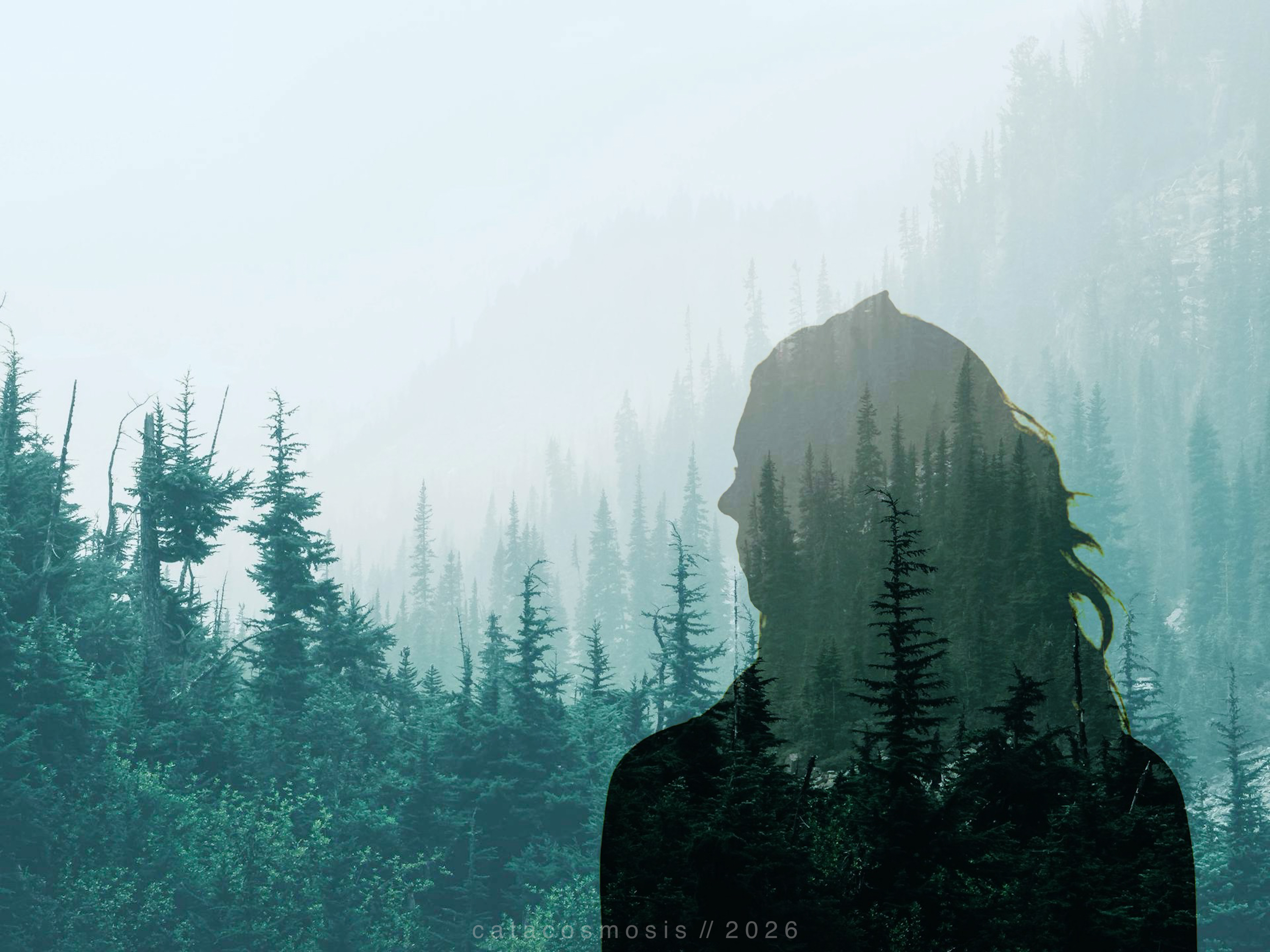
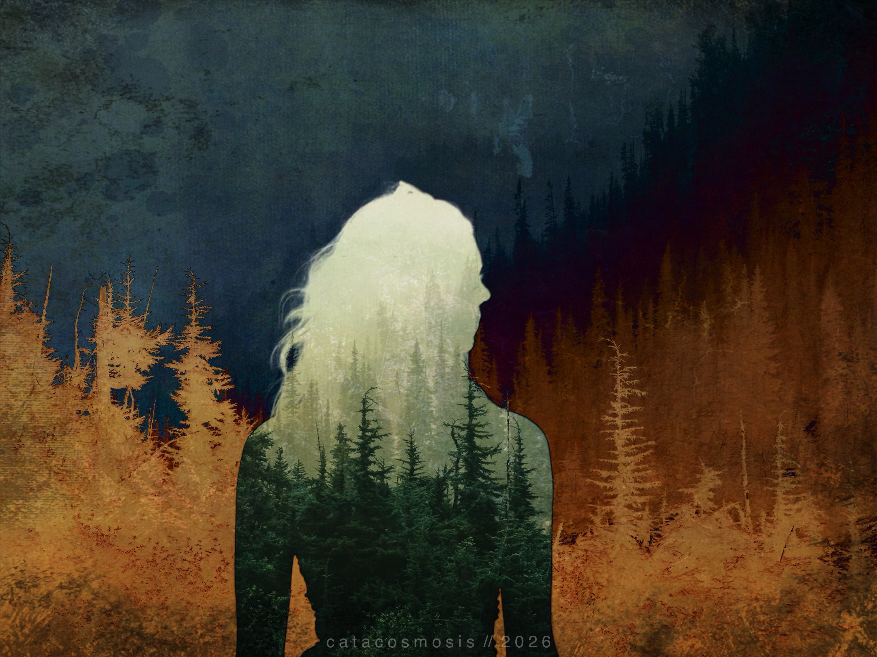
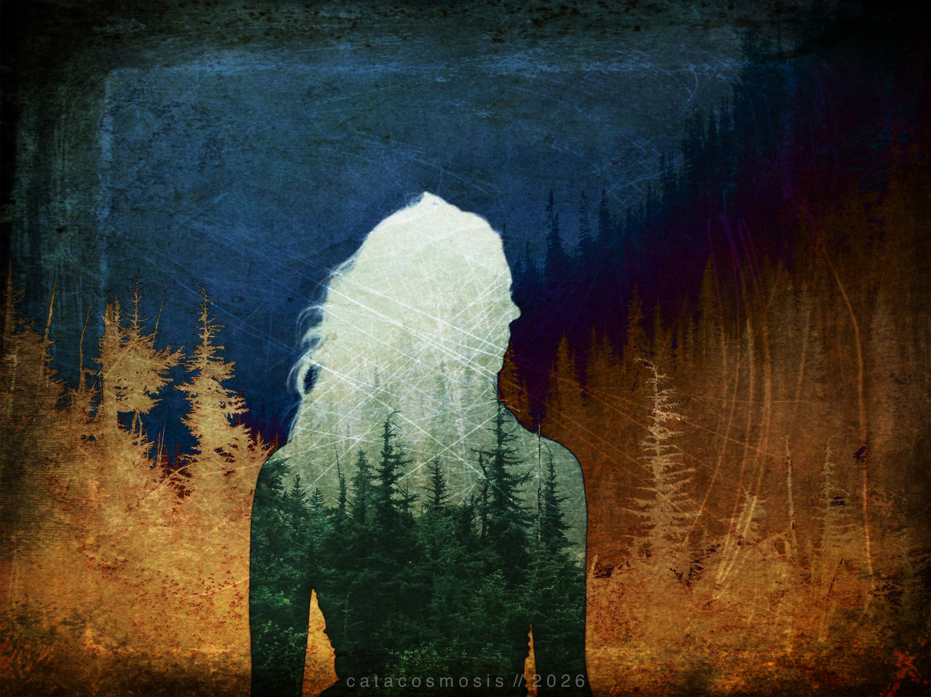
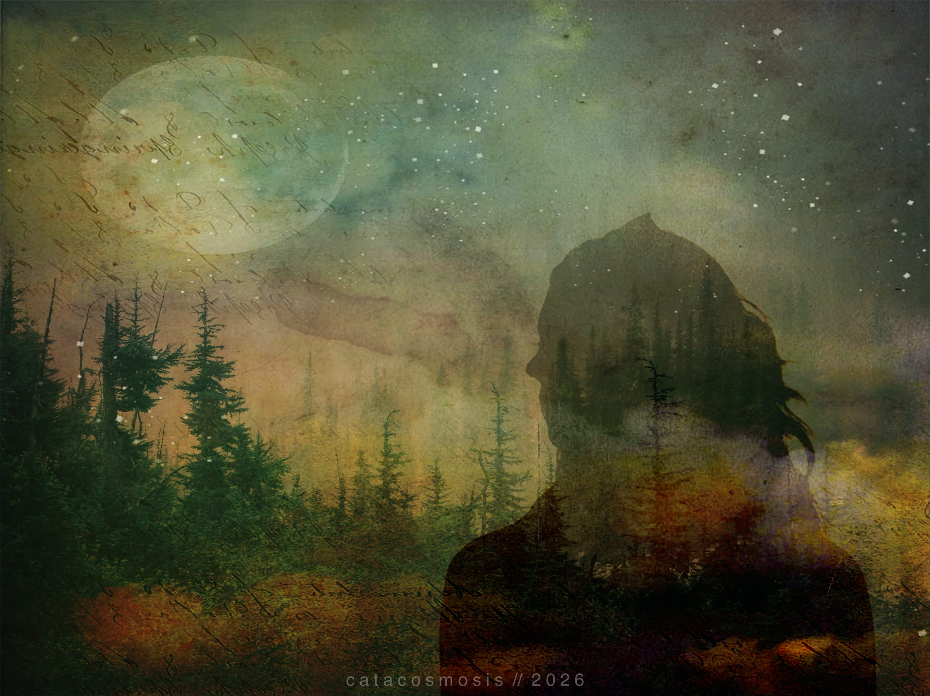
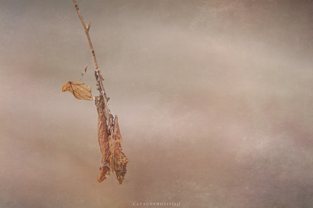
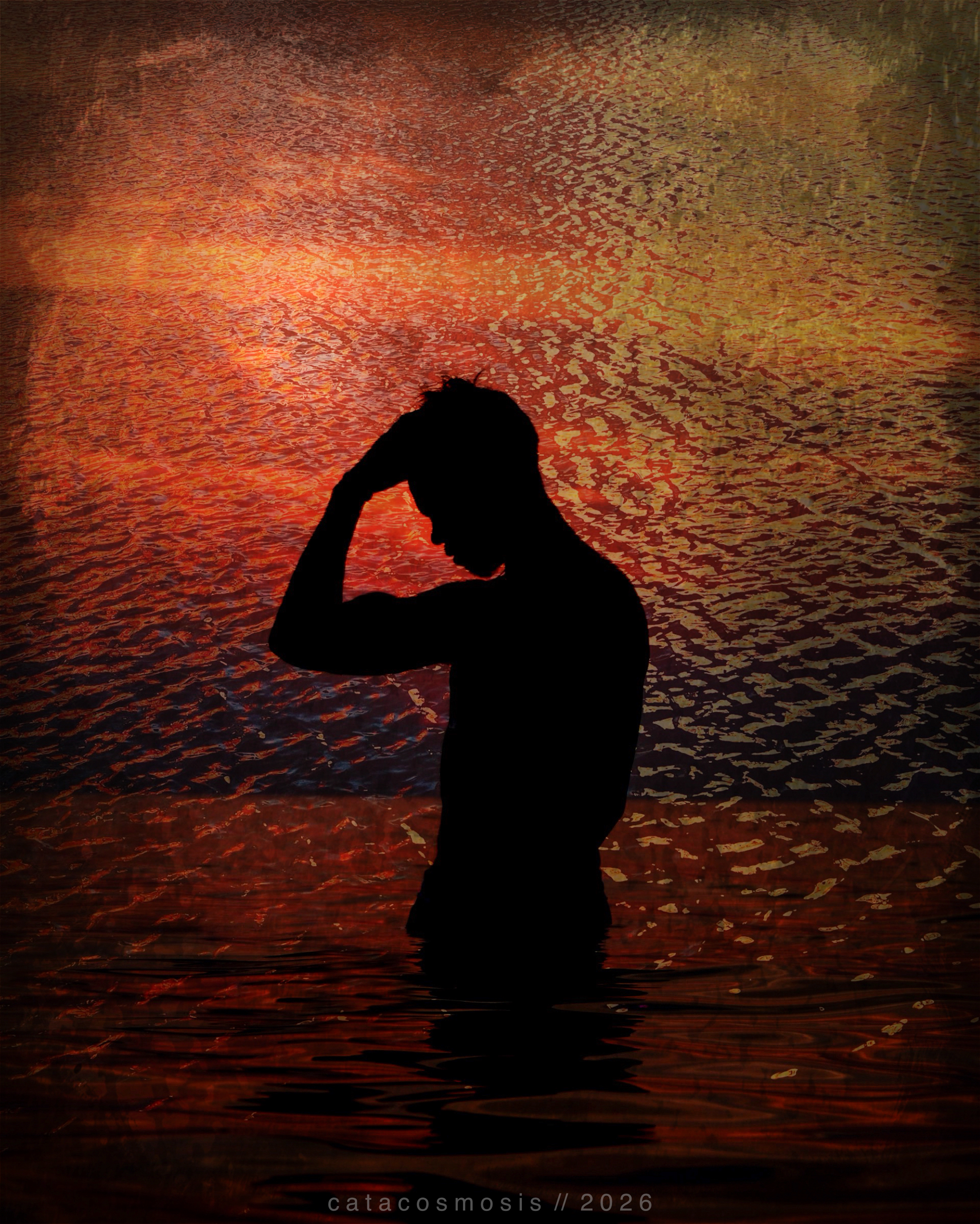
“She Carries the Forest”
The Tools I Actually Use
I work in two stages: compositing first, then finishing. Here is how that breaks down.
Desktop and Browser Apps for Building a Composite: Photopea and GIMP
Photopea is the tool I reach for most often now when I want more control. It is free, browser-based, and works almost identically to Photoshop. No download, no subscription.
The basic double exposure process in Photopea:
- Open your base image
- Import your second image as a new layer
- Try the Screen blend mode first. It lightens and ghosts one image over another beautifully. Multiply deepens and darkens. Overlay adds contrast and drama. Each one tells a different story with the same two images.
- Add a layer mask with a soft brush to refine where the blend shows through and where it stays clean
- Use adjustment layers on top, curves and hue/saturation especially, to pull everything into a unified mood
GIMP follows the same logic with a different interface. Both are free. That’s why I chose them.
Mobile Apps for Building a Composite: Union, Fragment, and Tangent
If you want to start quickly and stay on your phone, Union is the most direct route. It was built specifically for double exposure. You load two images, choose a blend mode, and use simple masking tools to control where each image shows through. It is intuitive enough to produce something genuinely beautiful in a short session, which matters when your energy is limited or you just want to experiment without committing to a long workflow.
Fragment (by the same Pixite team as Union) adds prism and dispersion effects. It is not a double exposure app on its own, but it layers beautifully on top of one, especially when you want a fractured or dreamlike quality to the final piece.
Tangent, also from Pixite, is no longer available in the App Store, but I still have it on my phone. It survived through iCloud backups and still works for now, though I expect it will stop working once iOS moves far enough along. I’m including it here because it’s genuinely part of how I work, not to send you on a hunt. If you want that same geometric, fragmented quality, Fragment by the same developers (mentioned and linked above) is still available, and lets you bring in geometric overlays and shapes beautifully. I’ve used it to add structure to a double exposure that would otherwise feel too loose.
Finishing in Mobile: Lightroom Mobile, VSCO, Hipstamatic, DistressedFX, Mextures
Whether I build a composite on the desktop in Photopea or GIMP, or put it together entirely on my phone, I almost always bring it into mobile apps to finish it. The finishing stage is where an image stops being a technical exercise and starts feeling like something. It’s where mood gets locked in, color finds its voice, and the texture that makes a piece feel lived-in gets added.
I should also point out that I don’t generally use all of these apps together — I pick and choose them based on what I want to achieve in my final image. Some pieces need one pass through Lightroom and nothing else. Others get layered through three or four apps before they feel right.
Lightroom Mobile is where I do tonal control, color grading, and clean watermarking before anything goes public. It is not fully free, but it is available both as a mobile app and through a web-based library, which means your work is accessible across devices without losing anything — and that contributes to my reasoning for paying for the full version yearly. The multiple access points plus the free storage are as valuable to me as the tools themselves. What I love about Lightroom Mobile is the precision it offers without being intimidating. The tone curve alone can completely transform the emotional register of an image, pulling it toward shadow and mystery or opening it up into something luminous. The color grading tools let me shift the mood of highlights and shadows independently, which matters a lot when you are working with a composite that has multiple light sources trying to coexist.
VSCO has a library of film emulation presets that do something algorithms struggle to replicate cleanly: they make a digital image feel like it was touched by something physical. I use it when I want warmth, grain, or that slightly faded quality that makes an image feel like a memory rather than a photograph. It is subtle work, but subtlety is often what separates a finished piece from one that almost got there.
Hipstamatic works differently from most editing apps, including VSCO, because it is built around the actual experience of analog photography rather than digital correction. The lens and film combinations introduce unpredictable light, color shifts, and vignetting that feel genuinely accidental in the best way. When I want an image to feel less constructed and more discovered, Hipstamatic is usually where I end up.
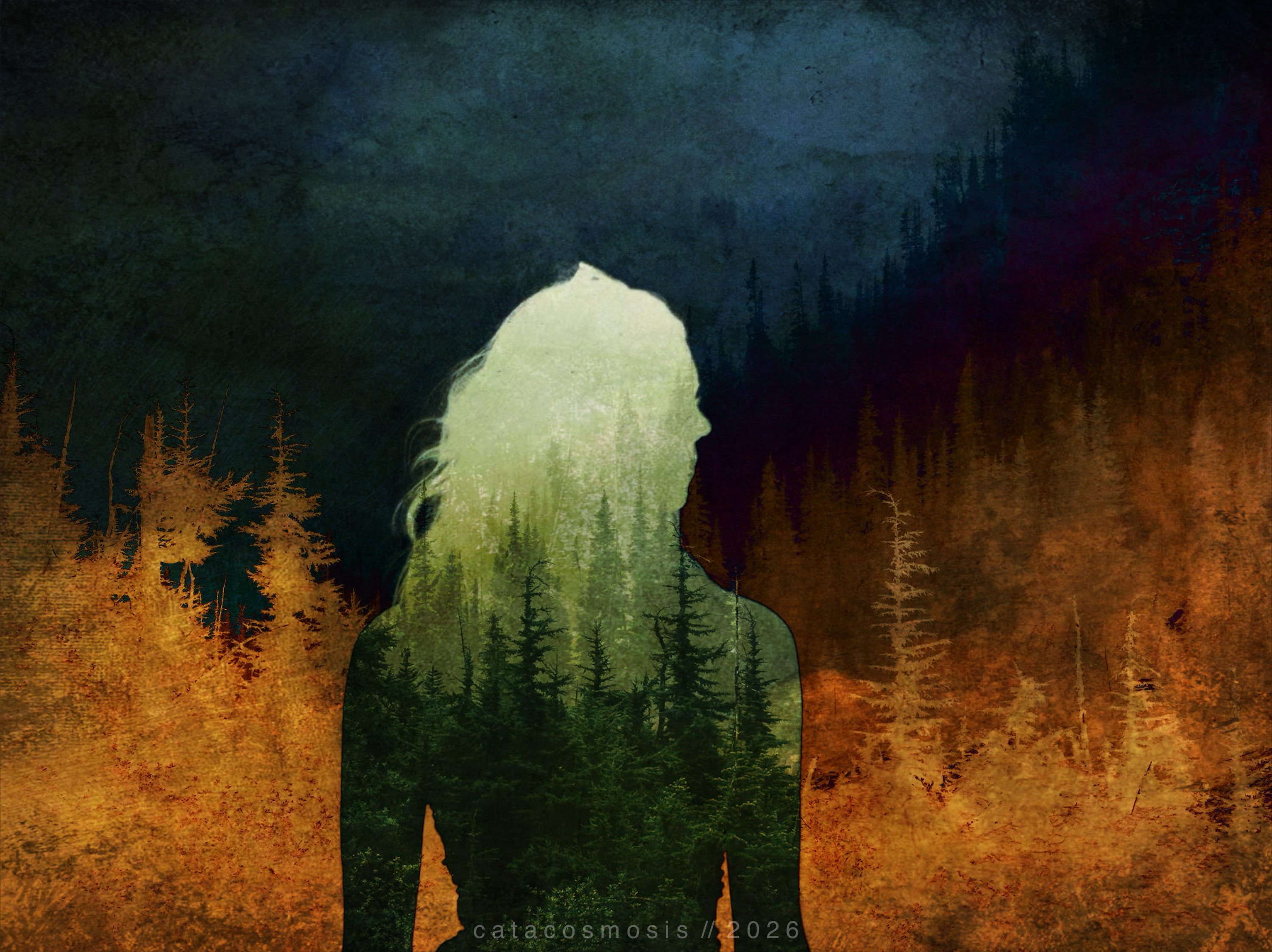
DistressedFX and Mextures are where I go for purposeful grain, texture, and weathering. DistressedFX leans toward grit (scratches, age, the feeling of something worn), while Mextures leans toward atmosphere (light leaks, painterly overlays, warmth that spreads across an image like morning fog). Together they cover a wide range of that quality that makes a final piece feel found rather than constructed. I rarely use both on the same image, but knowing what each one does well makes it easy to reach for the right one.
This two-stage approach — compositing first (whether desktop/browser based or mobile) and then finishing in mobile — gives you more flexibility than any single app alone. Each tool does what it does best.
Together, these apps form a surprisingly complete toolkit. In all honesty, the mobile apps alone are enough to take you further than you might expect. Union builds the foundation, Fragment adds structure and geometry. Apps like VSCO and Hipstamatic bring out mood and add aesthetic feel, DistressedFX and Mextures bring in texture and that weathered, painterly quality that makes a composite feel like art rather than just an edit, while Lightroom Mobile allows you to polish and watermark easily on the go. If you want more control or larger canvas work, Photopea and GIMP are both free and bring desktop-level power to the process without a subscription. You don’t need a lot of technical know-how — just your photos, a willingness to layer one thing on top of another, and a little time to see what happens.

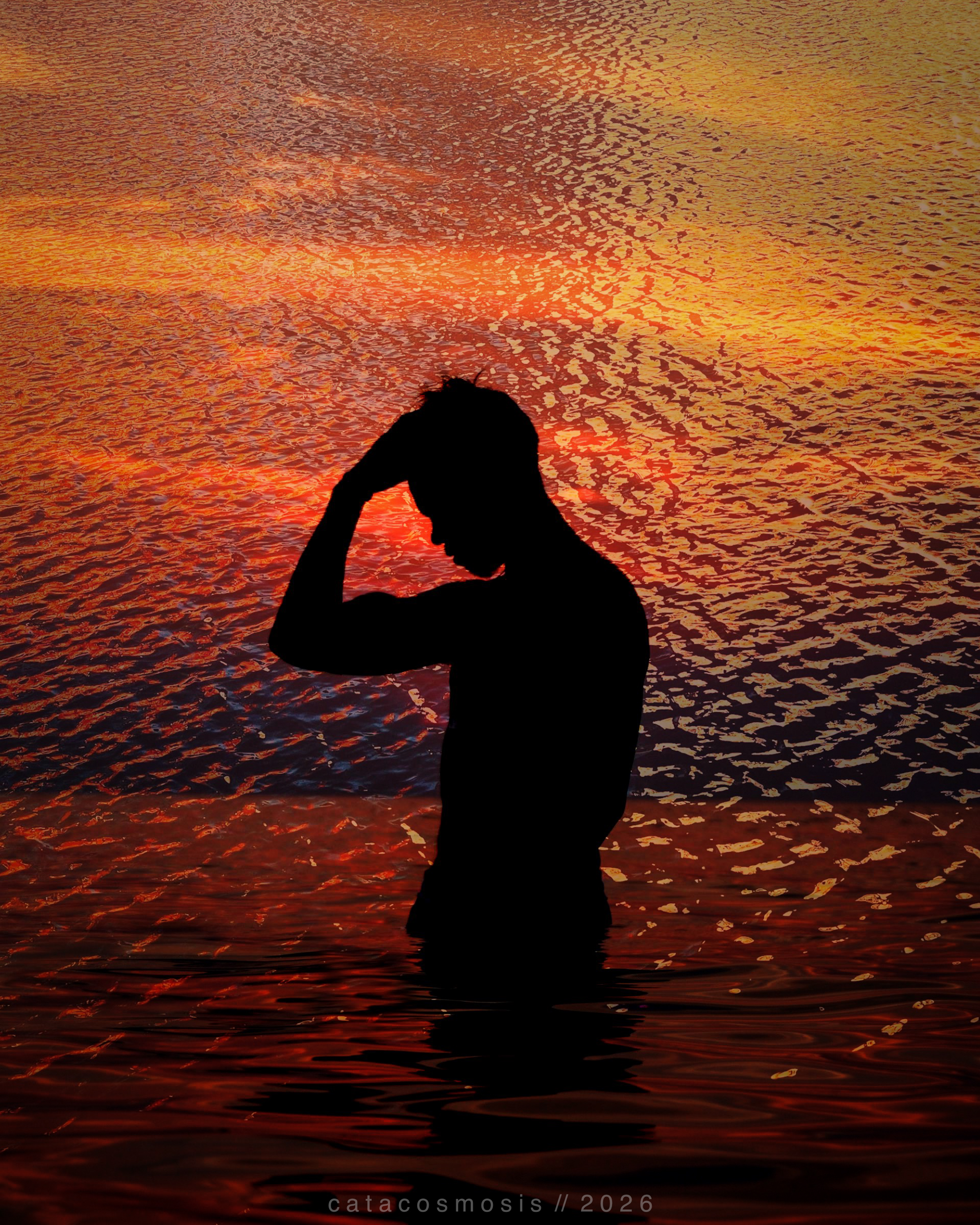
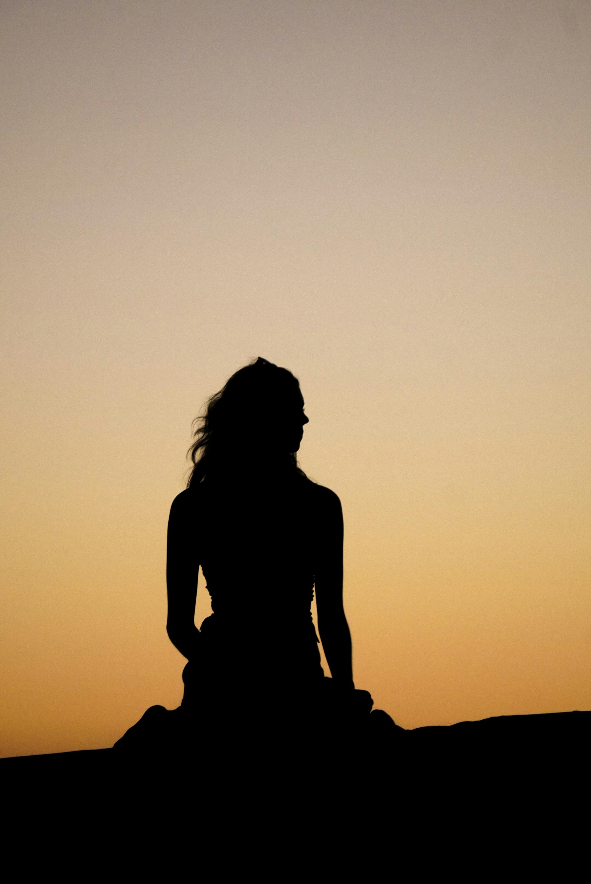
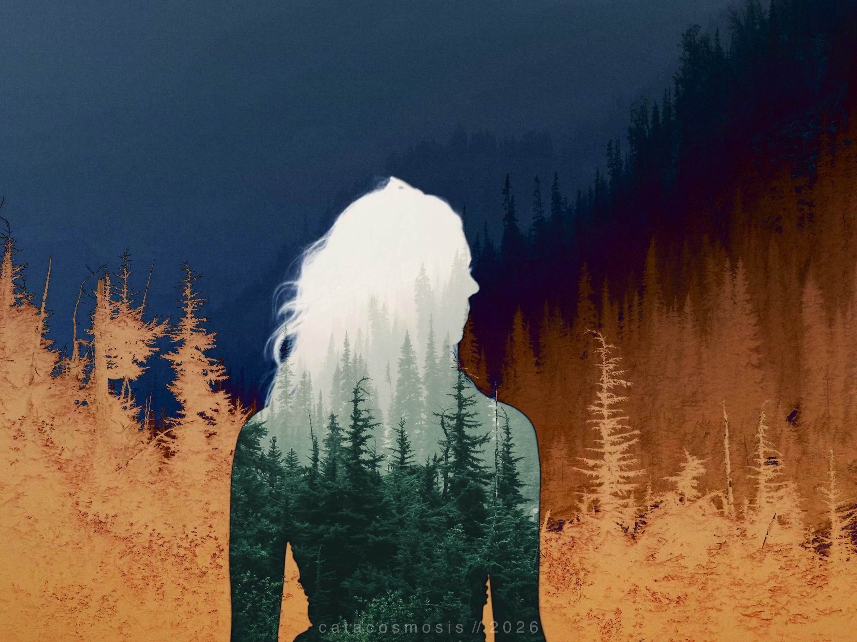
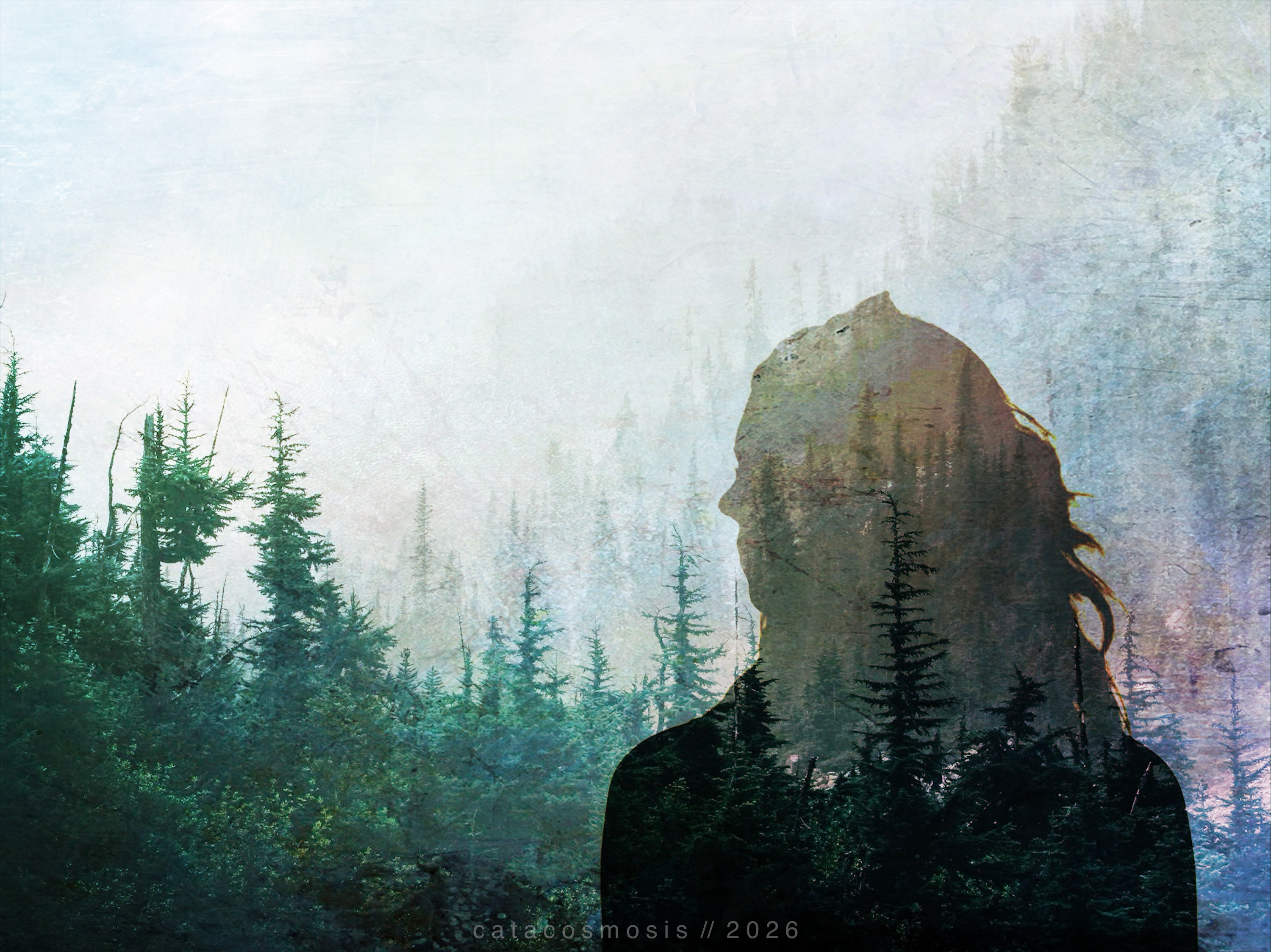
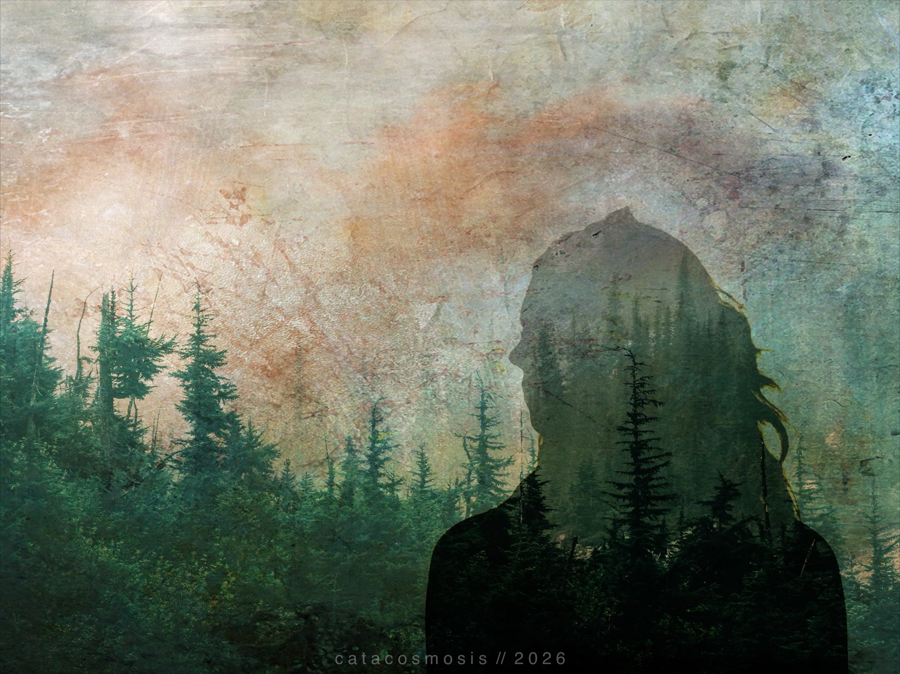
“The Burning Calm”
What Actually Makes It Work
The biggest difference between a double exposure that sings and one that just looks muddy is image selection. Your two images need to have something to say to each other. At least one of them needs strong contrast and a clear subject. If both images are busy, they will fight. If one is simple and one is complex, they tend to dance.
Pay attention to lighting direction. When your light sources are coming from opposite sides in each image, the blend reads as accidental. When they roughly agree with each other, it reads as intentional.
Color harmony carries the mood. A muted, desaturated base with one strong color accent will do more atmospheric work than a full palette competing with itself. That is where your finishing apps earn their place.
And less is usually more. It is tempting to layer every texture and effect you love, but a strong double exposure often has restraint at its center. Let two things be in conversation, not a crowd.
A Few Directions Worth Exploring
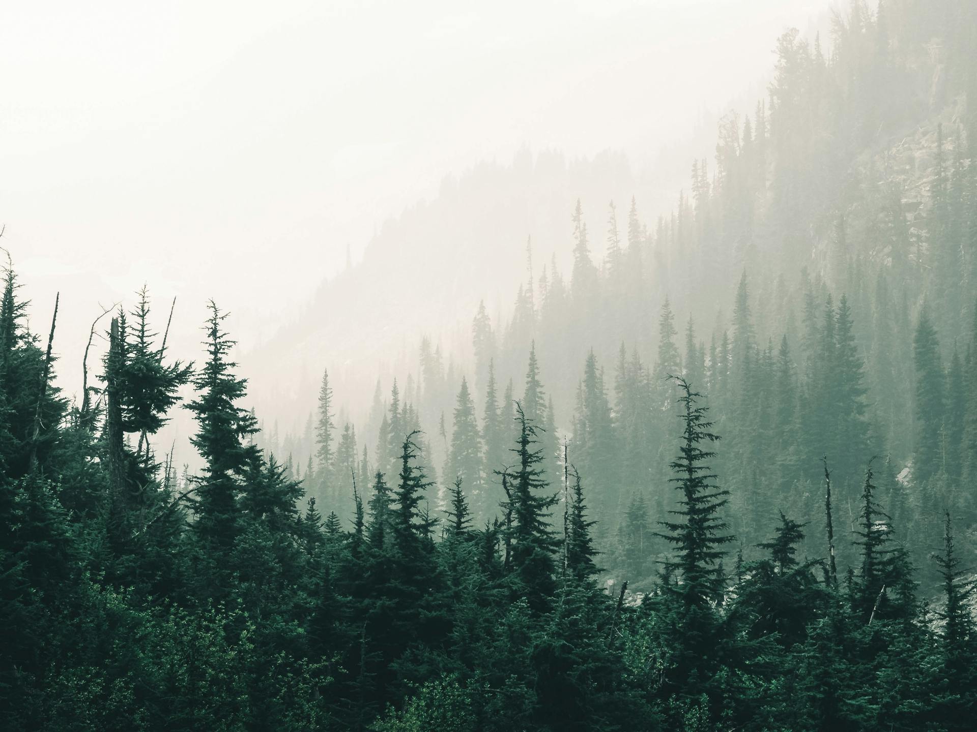
- Portrait with nature: a face emerging from or dissolving into trees, water, or open sky (this is my favorite and go-to style for double exposure work)
- Nature layered over architecture: organic forms in conversation with structure
- Light sources blended with a subject: sunlight, a window, a candle within another image
- Scripture or text layered over photography using a Screen blend: subtle, stunning, and deeply personal
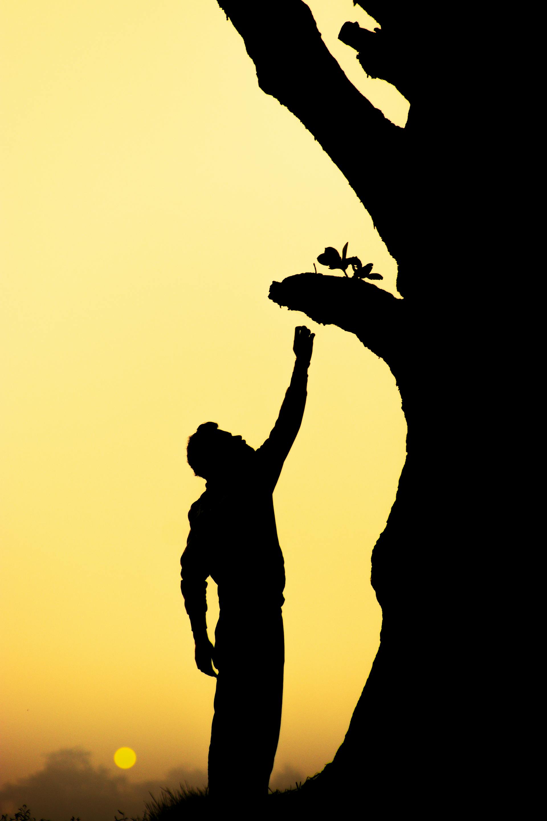
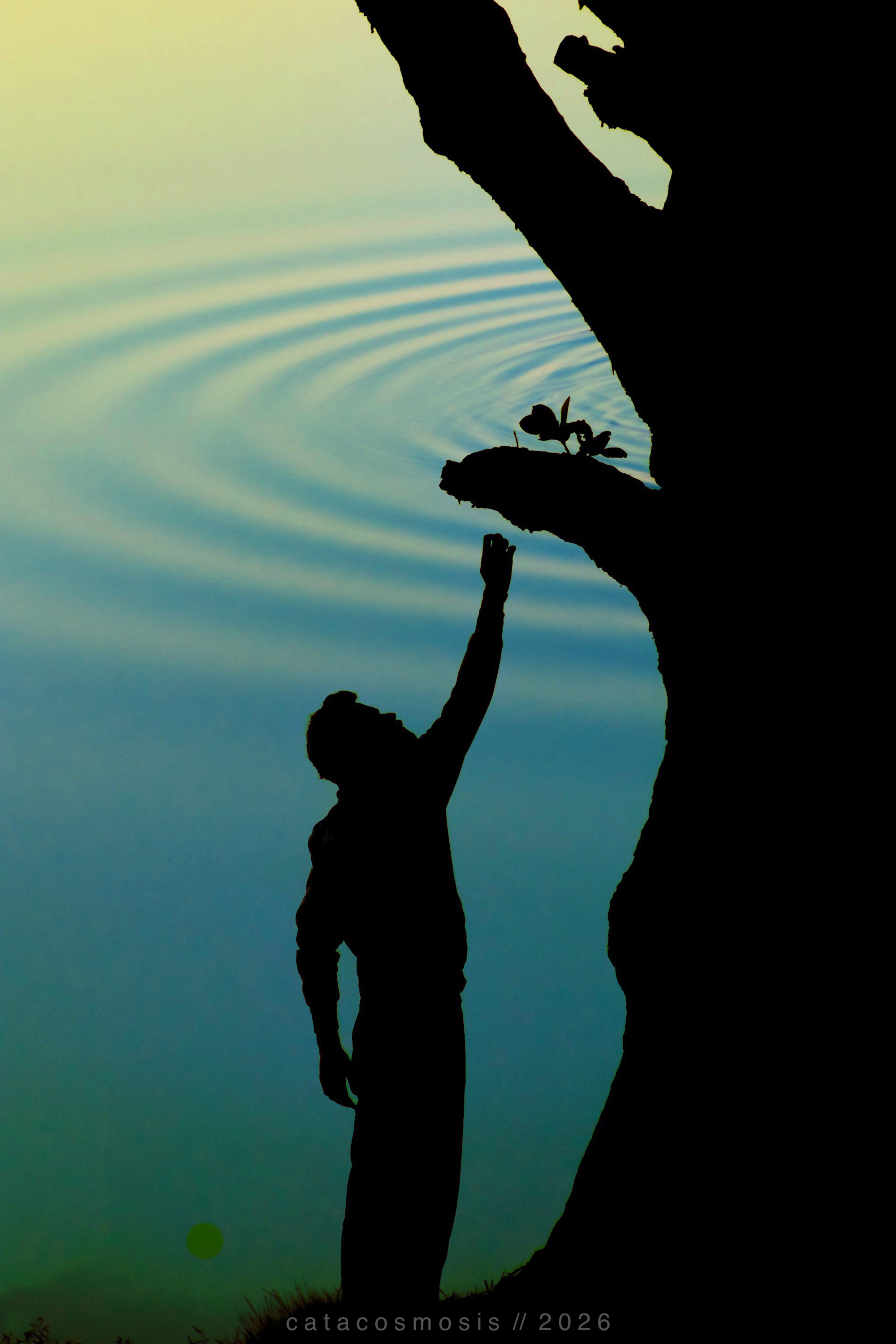
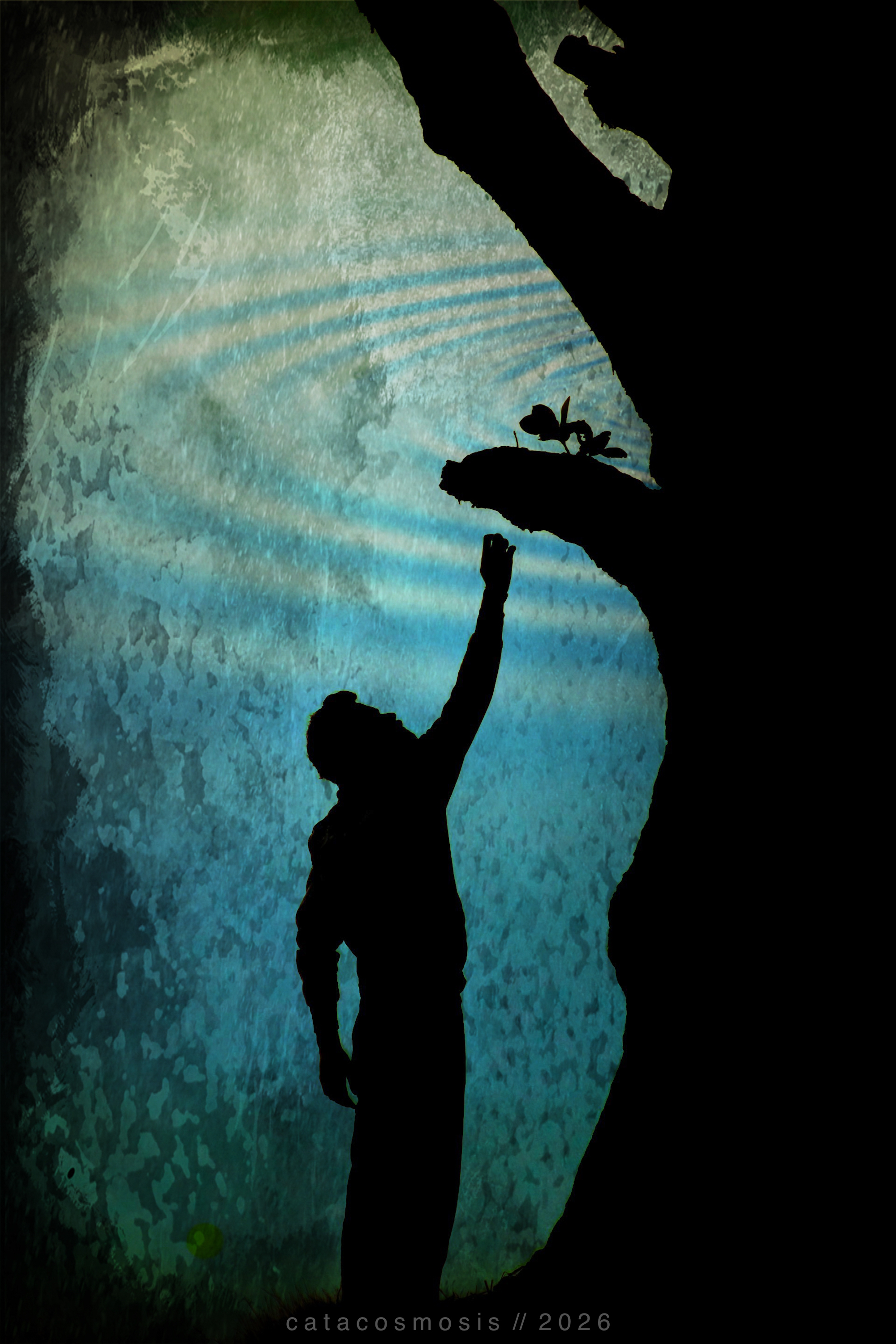
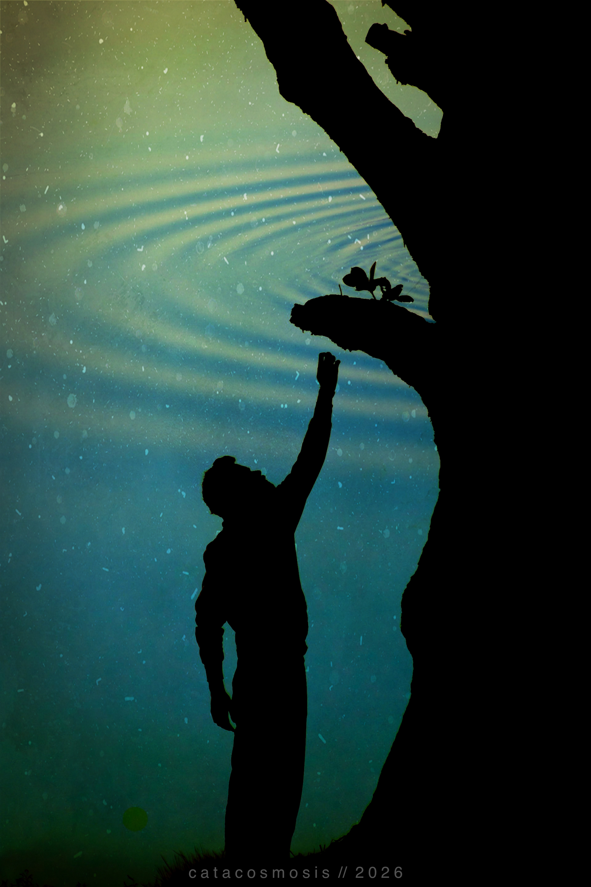
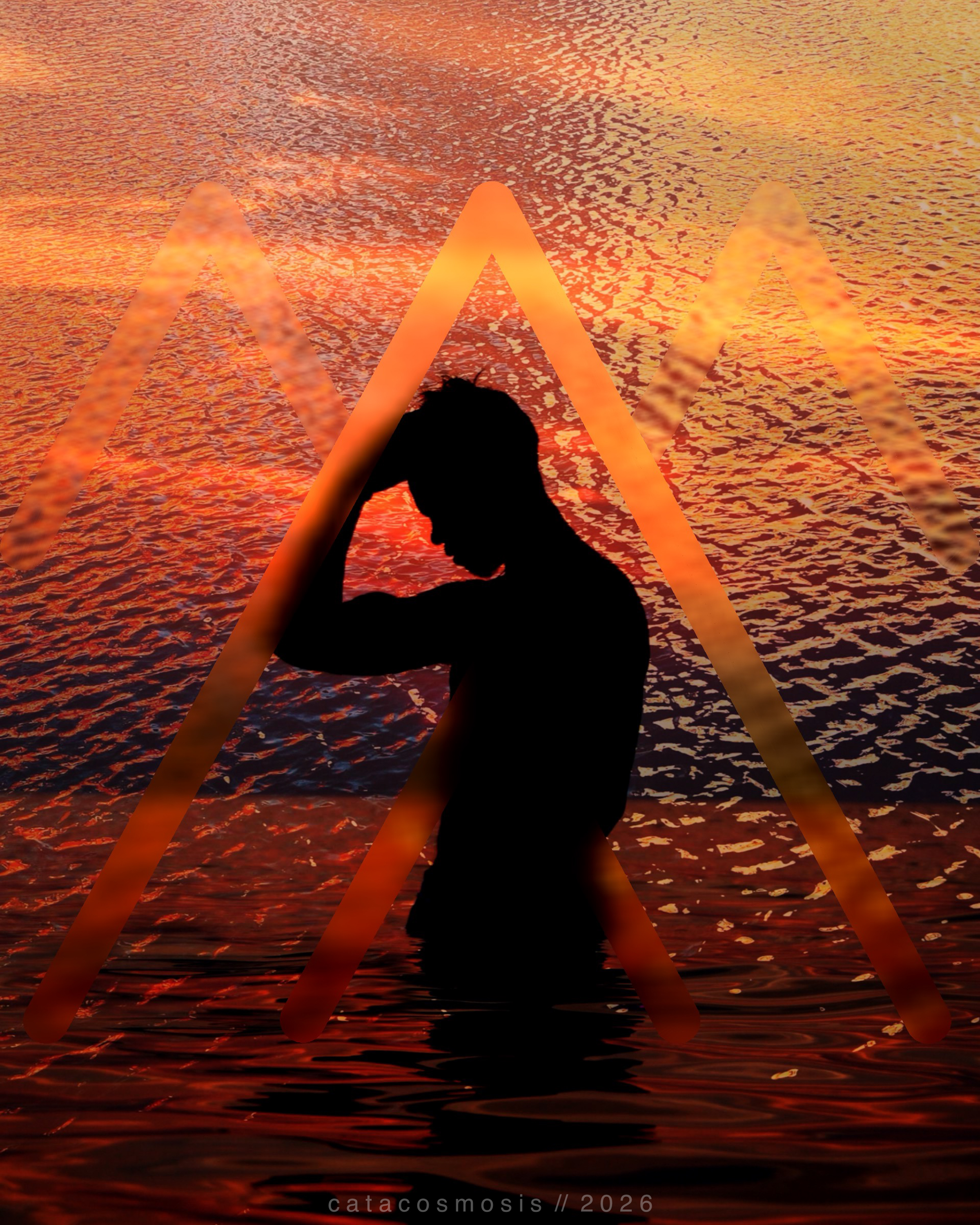
“Reaching”
Closing Thoughts
Double exposure rewards experimentation more than it rewards perfection. You will not always know what you are going to get, and that is part of what I love about it. Two things that exist separately become one thing that did not exist before.
There is something philosophical, and almost theological, and even spiritual in that, if you let yourself see it.
If you want to try it, start with Union on your phone and two photos you already love. See what they say to each other. That is usually where it begins.